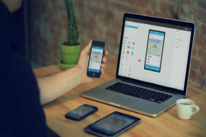
Web development has advanced in leaps and bounds over the past few years. The rapid increase in the popularity of mobile devices and mobile browsers means that it’s important to make sure that your website is attractive and fully responsive on devices of all shapes and sizes.
Similarly you’re getting professional web designers, such as Slinky Web Design, to build a website that’s targeted primarily at those browsing via mobile devices, then you need to keep a few things in mind to make sure that you’re building the best website possible. Consider the following when developing a mobile website:
Make Sure That You’re Using A Responsive Design
Although most modern website templates and themes come with built-in mobile responsiveness, it’s extremely important to double and triple check this.
Basically, a mobile responsive design is one which includes CSS3 code that allows your website to adapt to different screen sizes. Responsive code contains ‘break points’ that tell your website to render differently according to the size of the screen that it’s being displayed on.
I’d recommend first checking that your site is well designed with respect to its responsiveness and mobile appearance. Then, I’d recommend checking its appearance on a wide range of different sized devices.
Keep Your Layout Simple
Remember, mobile devices are usually quite small with a limited amount of screen space. It’s therefore important to make sure that your mobile design is simple and, in many ways, minimalist.
Think carefully about whether or not you need to include things like navigation bars, multiple columns, menus, and scrolling elements. If you do decide to include them, it’s important to make sure that they are placed carefully so that they don’t draw the eye away from your site’s main content.
Use Prominent “Call To Action” Features
People who are browsing your website via their mobile device will usually be time-pressured, rushed, and easily distracted. It’s therefore important to make things as easy as possible for them.
One of the best ways to do this is to make your call to action icons or buttons large and prominent. For example, if you’re trying to sell products, you should use large “buy now”, “check out”, and “add to cart” buttons to encourage people to follow through with their purchase.
Be Careful Using Heavy Media Files
Since a lot of mobile browsing is done via mobile internet, it’s important to make sure that your website is optimised to load fast and efficiently. You can do this by removing large image and video files from the mobile version of your website and by making sure that the visual content you keep is compressed with the smallest file sizes possible.
Conclusion
If you’re building a mobile website then you need to think carefully about your site’s general design features. It’s important to include mobile friendly elements and features that will improve the user experience, otherwise your site simply won’t be successful. Focus on things like responsive design, minimising file sizes, placing prominent calls to action, and making sure that your overall design is minimalist and not too cluttered.
Good luck!

